At Taylor Wells, we speak to companies across all industries and at different stages in their pricing evolution. That includes creating the pricing page best practices for their businesses. Pricing pages that are effective strike the proper balance between commerce and creativity. They simplify the most key aspects, convey cost, and provide particular offers to segments of service users. As to whether price arrangements have large discounts, are dependent on consumption, or are divided into annual or monthly payments, all of these details should be simple to grasp. Customers’ purchasing decisions become smoother when they have clarity.
>Download Now: Free PDF Driving Pricing Strategy to Maximise EBIT Growth
A recent study found that 73% of customers are willing to pay more for products and services that promise complete transparency. Additionally, 39% of buyers are willing to switch brands for better information. Thus, trustworthy and straightforward pricing pages benefit both the company and the customer. However, the interesting fact is that even established companies often do not have a better or more clear pricing proposition and strategy than newer entrants. In fact, sometimes, being an established business can also mean that you are more focused on operations rather than commercial performance.
You’ve already done well if you’ve designed a website that successfully directs customers to a pricing page. But how can you persuade these potential customers to buy from you?
In this article, we will cover all there is to know about pricing pages. We provide the complete definition. Then we inform you about the best practices for pricing pages based on the most successful and effective businesses. For this part, we also explain how to implement it for your own website. We argue that the most profitable pricing pages use basic language and present few but clear pricing options. Finally, we explore the best ways for SaaS companies to design their pricing pages and provide examples.
We are big believers in learning from the best practices being implemented by leading and progressive companies as well as highlighting interesting developments in academic work into psychological pricing and influence. By the end, you’ll learn and make your pricing page the driving force behind your business’s profitability.
Capability Building Programmes For Pricing & Sales Teams!
Pricing Page Best Techniques and Practices from Leading Websites: What can we learn?
What exactly is a pricing page?
A pricing page is a website landing page that displays the various pricing plans or levels offered to clients, as well as the benefits and features provided in each category. For businesses, the most crucial page on their website is the pricing page. In the current digital age, building the optimal pricing page is frequently critical to profitability.
The most competitive pricing pages do not have to be too visually appealing or show every feature that your product or service has to offer. The truth is that we’ve found that ease and clarity often perform best. The most successful pricing pages in terms of conversion rates and customer preference all follow a few simple guidelines.
These standards include: maintaining the design and layout simple, clear pricing presentation, adjusting each tier with one target customer group, letting your brand identity stand out, and focusing your pricing around your value propositions. So, how can you create the most efficient pricing page for your company?
What are the factors to consider when developing a pricing page?
When developing a pricing page, several critical factors should be considered to ensure it effectively communicates value and encourages customer conversions. Firstly, conduct thorough market research to understand industry standards and competitor pricing strategies. This insight provides a foundation for setting competitive yet profitable prices.
Clearly define your value proposition. Highlight the unique features and benefits of your product or service that justify the proposed pricing. Mailchimp’s pricing page excels in showcasing its value proposition, emphasising key benefits for different user segments.
Segment your pricing plans based on customer needs. Tailor options to cater to various user requirements and budget considerations. This approach allows customers to choose a plan that aligns with their specific needs. Zoom’s pricing page is a prime example of effective segmentation, offering plans for different user scenarios.
Be transparent about what each pricing tier includes. Clearly outline features and limitations to avoid any confusion. Canva’s pricing page is a model of transparency, presenting detailed information on what users get with each plan.
Consider the psychological aspects of pricing, such as anchoring and tier positioning. Strategically place the most popular or recommended plan prominently to influence customer decisions. Amazon’s pricing strategy, especially on its Prime membership page, is a classic example of effective tier positioning.
Regularly review and update your pricing page to stay aligned with market trends and the evolving needs of your customers. This ensures your pricing strategy remains dynamic and competitive in the ever-changing business landscape.
What are the best pricing page templates and practices?
1. Narrow your pricing options to a few.
Your pricing models should be simple to understand. Com1plicated pricing models do reduce sales. Simplifying may be difficult if you serve multiple consumer segments. However, the less your buyer has to contemplate before choosing a package, the greater your conversion rate. Hiring a pricing team will enable you to develop the best price for your products and services.
Our findings show that incremental earnings gains can begin in as little as 12 weeks with the right setup and pricing team in place. The team can capture at least 1.0-2.25% more margin after 6 months using superior price management techniques. After 9-12 months, organisations frequently generate 3-10% additional margin every year as they find more complex and previously unrealised possibilities, efficiencies, and risks.
Introduction to Value Culture 💡 Podcast Ep. 96!
2. Highlight a plan that will appeal to the vast majority of your potential users.
As a manager, you know better than anyone else what options would meet most of your customers’ expectations. Reduce customer misunderstanding by emphasising a plan that you believe will be a good fit for the majority of customers.
Yet, it should not be your most pricey plan. It must be a price plan that, based on evidence, the majority of your clients will find valuable. As evidence, a recent study found that when a pricing plan is highlighted, it is more likely to be picked. Highlighting also reduces friction on pricing pages and buyer uncertainty.
3. Communicate and provide brief yet thorough information.
Customers despise uncertainty. If they are going to hand over their money, they want the procedure to be as simple as possible. In a nutshell, people want to understand what they’re paying for and how it will impact them. Thus, your pricing page must clearly express what your product or service will do for the customer. Note that your pricing page is not the place to be brilliant or show off your knowledge of complicated terminologies. Making your pricing page as simple as possible should be a priority in your overall concept.
4. Explore having a mobile-friendly pricing page.
In today’s digital landscape, having a mobile-friendly pricing page is non-negotiable. Mobile users constitute a significant portion of your audience, and a seamless mobile experience is paramount. Begin by ensuring that your pricing page is responsive, adapting effortlessly to various screen sizes. For instance, Dropbox’s pricing page is optimised for mobile, providing a smooth and intuitive navigation experience.
Simplify the design for smaller screens, emphasising clarity and easy navigation. Use concise yet impactful headlines and subheadings to convey information efficiently. Squarespace achieves this by presenting key pricing details in a straightforward manner on their mobile-optimised page.
Optimise images and other visual elements for quick loading on mobile devices. Slow-loading pages can deter users, impacting their experience and potentially leading to lost conversions. Airbnb’s mobile pricing page is a prime example of fast-loading visuals that enhance user engagement.
What is the best way for SaaS companies to design their pricing page?
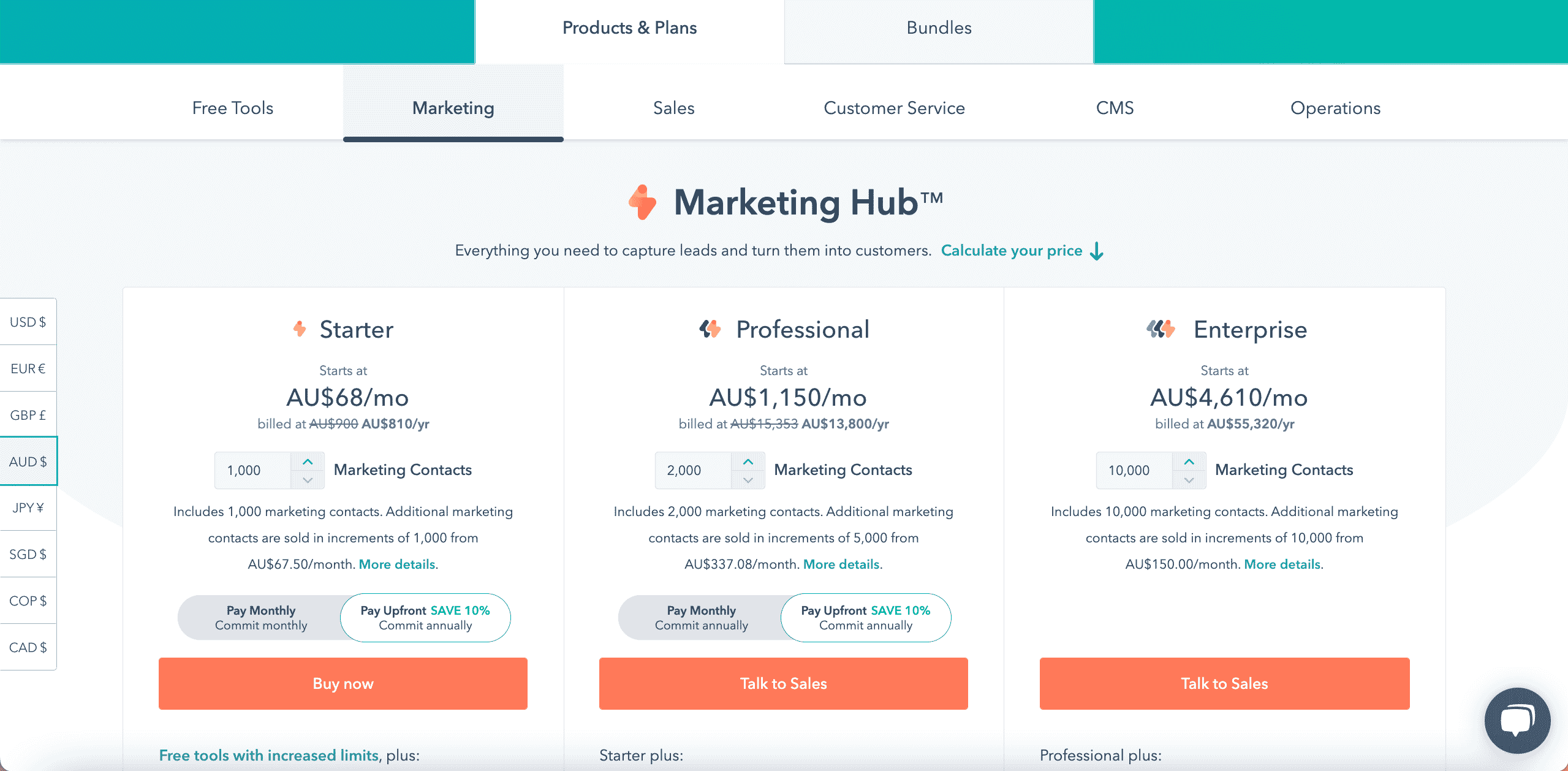
Whenever you are booking an online service – you have probably become accustomed to seeing very similar pricing plan layouts. For example, see the page from Hubspot marketing below:

If you notice, there are several common and academically justified approaches on the pricing page best practices. Firstly, the tiered and differentiated three pricing options where different functionality is given to different user groups. This ensures price controls and that all customers do not end up paying the same amount.
The three pricing tiers approach has also been proven to increase sales of the middle option – i.e. a higher cost version – the Enterprise version makes the middle option look relatively cheaper (see our blog on relative prices – price value).
You will notice that the middle option has been highlighted and helpfully called “Most Popular Option” – this is in line with the work done on Influence by Cialdini – that simply highlighting an item on a menu significantly increases sales.
You can also note that the “most popular option” is in the middle. Did you know that people select items that are shown in the middle more often, no matter what they are?! This is according to statistical studies.

The example above is from Zendesk, an online service desk provider. You can see that they offer freemiums for each option and restrict something within the lower price options. For instance, restricting branding.
Order of pricing page and its best practices: Due to the concept of anchoring, there is evidence that putting the highest price first i.e. on the left of the screen can boost sales as it anchors you to a higher price level. Note that these two examples do not use this approach.
Pricing Recruitment For Pricing Managers!
Other Excellent Examples of Pricing Page
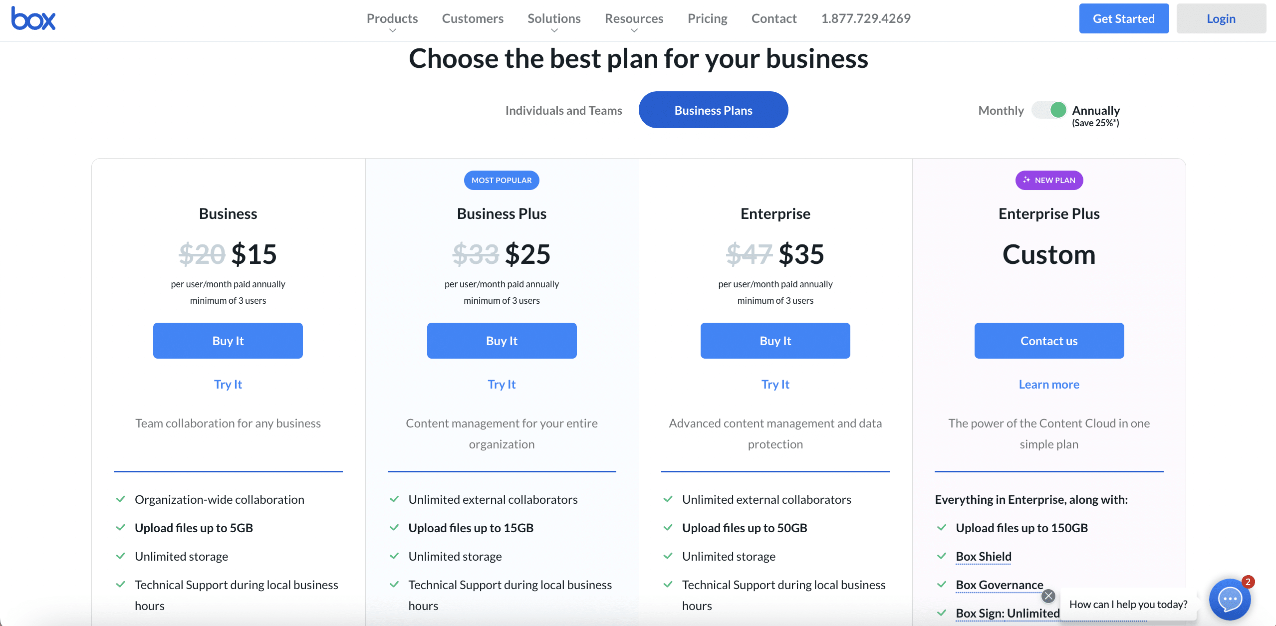
1. Box

Box’s pricing page is informative, user-friendly, and coherent, prompting users to select the best plan for their needs. They also do a good job of emphasising the most cost-effective option on the page.
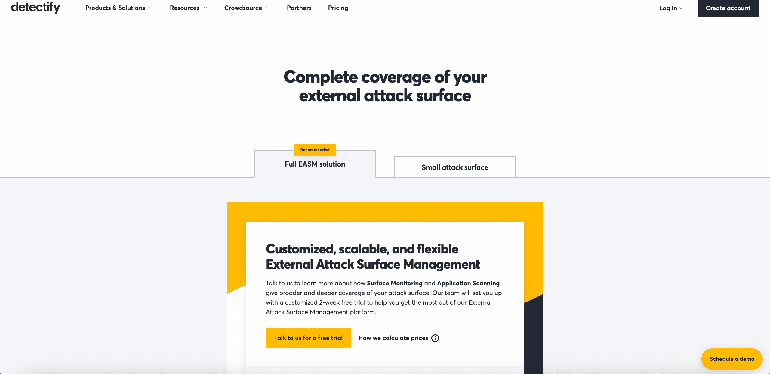
2. Detectify

Detectify’s pricing page design is unlike the others. But! It creates a really sleek user experience in our opinion. Customers can choose between two simple options depending on their use case. Both buttons direct users to start a free trial, making it simple for visitors to realise what they need to do.
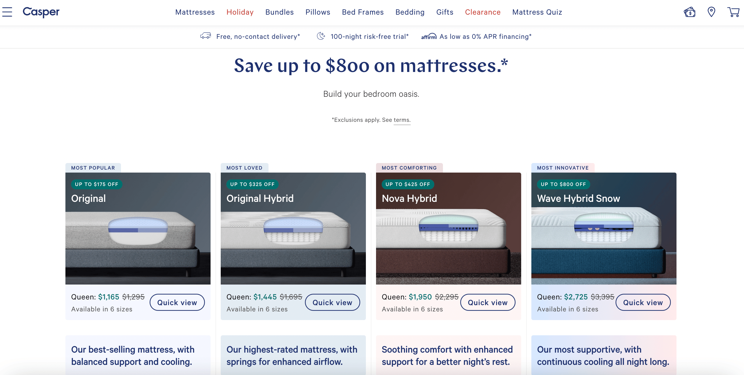
3. Casper

Casper’s pricing page is appealing and simple to navigate. What really sets their pricing apart is that the company will go to an unsatisfied customer’s home and collect the mattress for free, as well as provide a full refund. This is a fantastic testament to their commitment to customer service. This builds trust with potential buyers even before they make the purchase.
Note:
We do not intend to cover aspects of marketing and driving conversions in this short post. Of course, there are many other ease of transaction systems such as Amazon’s patented one-click shopping. Others opt for a “call to action” or social proof such as testimonials and money-back guarantees. So, all of these steps are capable of increasing conversions. But they are more in the realm of marketing than this blog intends to address.
See our related blog on what we can learn from restaurant menu prices.
〉〉〉 Get Your FREE Pricing Audit 〉〉〉
Bottom Line
As with everything, there are tricks of the trade that can increase your conversions. The purpose is to nudge people into choosing the service that you prefer to supply. These pricing principles apply as much to a restaurant menu – as it does to online SAAS sales.
When you see a graded service offered by an online SAAS with a free trial with one option highlighted, this is a manipulation tactic for making a specific choice. Other things you will see are monthly or annual discounts, the number of agents per month, and potentially credit card surcharges.
The same goes for your favourite restaurant. Check out the video below on the absurd psychology of restaurant menus:
For a comprehensive view of driving pricing strategies to maximise growth, download a complimentary whitepaper on How to Drive Pricing Strategy to Maximise EBIT Growth.
Are you a business in need of help to align your pricing strategy, people and operations to deliver an immediate impact on profit?
If so, please call (+61) 2 9000 1115.
You can also email us at team@taylorwells.com.au if you have any further questions.
Make your pricing world-class!

